We’re excited to reveal Community Vision’s refreshed branding and website—an update that reflects our mission to advance racial and economic equity, land justice, and community ownership across California.
As our work has grown and sharpened over the years, we saw the opportunity to update our look and website to better show who we are today and better serve the communities we partner with. This refresh is about alignment, cohesion, and clarity—with a new website that makes it easier for organizations to learn about our financing and advising, connect with our team, and explore our resources.
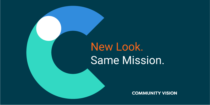
We took great care in designing a visual identity that reflects our values. Our new logo and color palette balance grounding blues with brighter tones like teal, orange, and lime—refelecting that we’re both a steady partner and a vibrant, community-centered organization.
While our colors and design have evolved, our mission is the same. We remain committed to empowering community-rooted organizations across California, providing flexible capital and strategic advising to help purchase, preserve, and develop the spaces that are pillars of thriving neighborhoods and communities.
We’re proud to share this refreshed brand with you and invite you to explore our new website. Thank you for being part of our community and story.
If you have any questions, please reach out to Matias Bernal, VP of Development, at mbernal@communityvisionca.org, or Camille Clinton, Marketing and Communications Officer, at cclinton@communityvisionca.org.
